Why did you build Patina?
I wanted to use my phone less, and I was tired of seeing people get lost in their devices. Other apps solve this through notifications or restrictions, but notifications are easy to ignore, we get too many to notice one more, and restrictions feel like punishment.
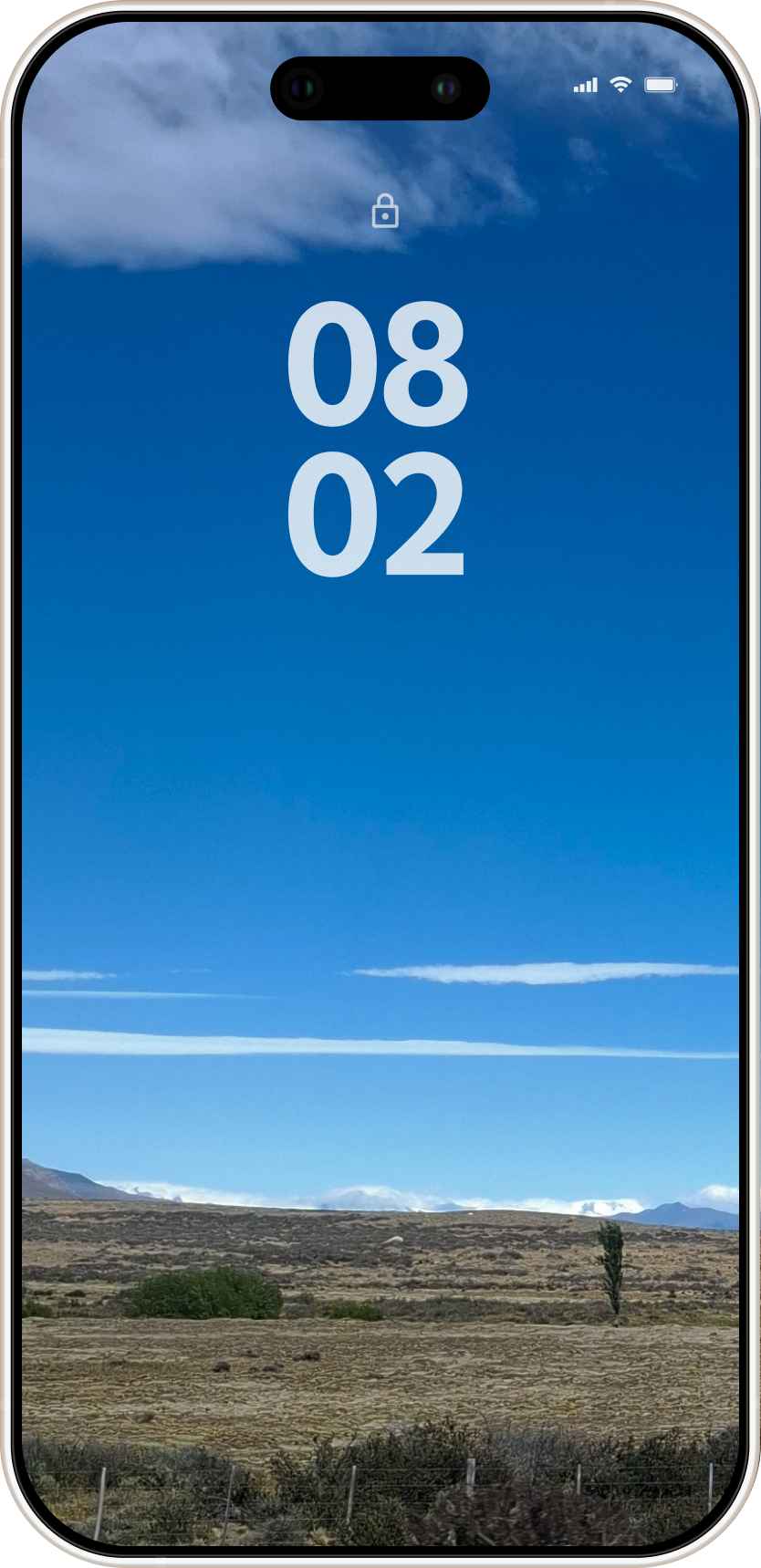
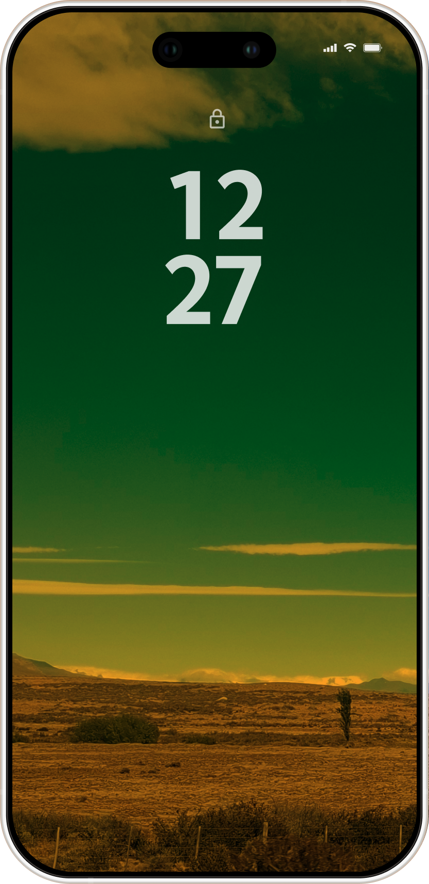
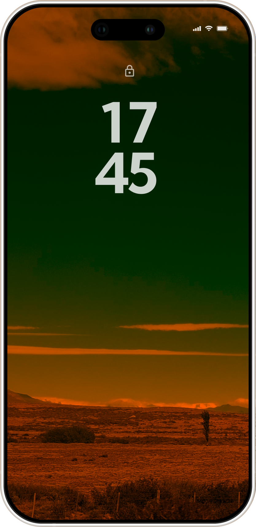
So I thought about color, something that changes gradually through the day so you notice it before you even unlock. Simple, quiet, no judgment. For people who want awareness, not discipline tools.
How did you validate the concept before starting?
Before designing anything I spent one hour manually creating tinted versions of the same wallpaper and set up Android's automation tool to swap them at different times of day. Then I tried it for two days.
The color shifts were noticeable and not annoying, so I decided it was worth building it, at least for myself, and it was a chance to experiment with vibe coding and ship a real product solo.
Can color actually change an automatic impulse?
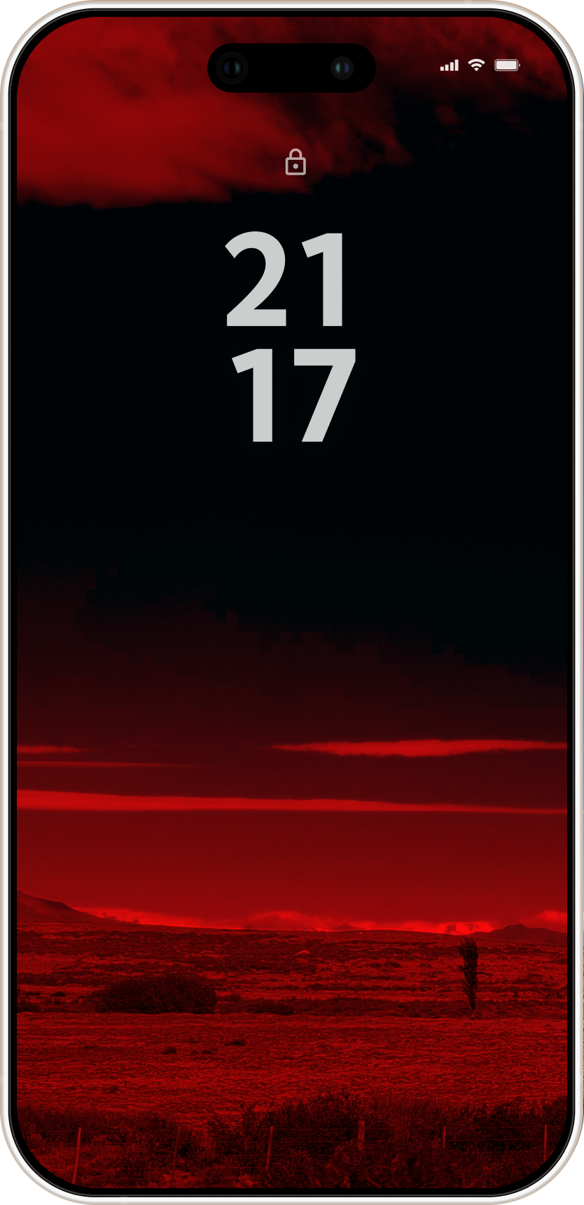
Reaching for the phone is a deep habit that's difficult to break, which is why I chose color, it carries meaning we don't have to learn. Yellow and red signal warning across cultures, so my bet was that something this embedded could hold meaning even after repeated exposure, when most signals lose their impact.
First users said the color made them pause before unlocking. Some put the phone down, so the results are promising but I'm still measuring whether it holds up over time, and what could make the signal stronger.
What if you are color blind?
I thought about that limitation from the beginning and I tested the colors for color blindness. They read differently but not differently enough to make the signal clear.
I made the decision to design for most users first and ship. I'm working now on a solution for people with color vision differences.
Why the name Patina?
Patina is the layer that forms on materials over time. It's a process I hear about a lot in architecture.
After a few ideas this one felt right immediately. Something that accumulates with use and time. That's exactly what the app does to your wallpaper.
The app experience is very minimalist. Why?
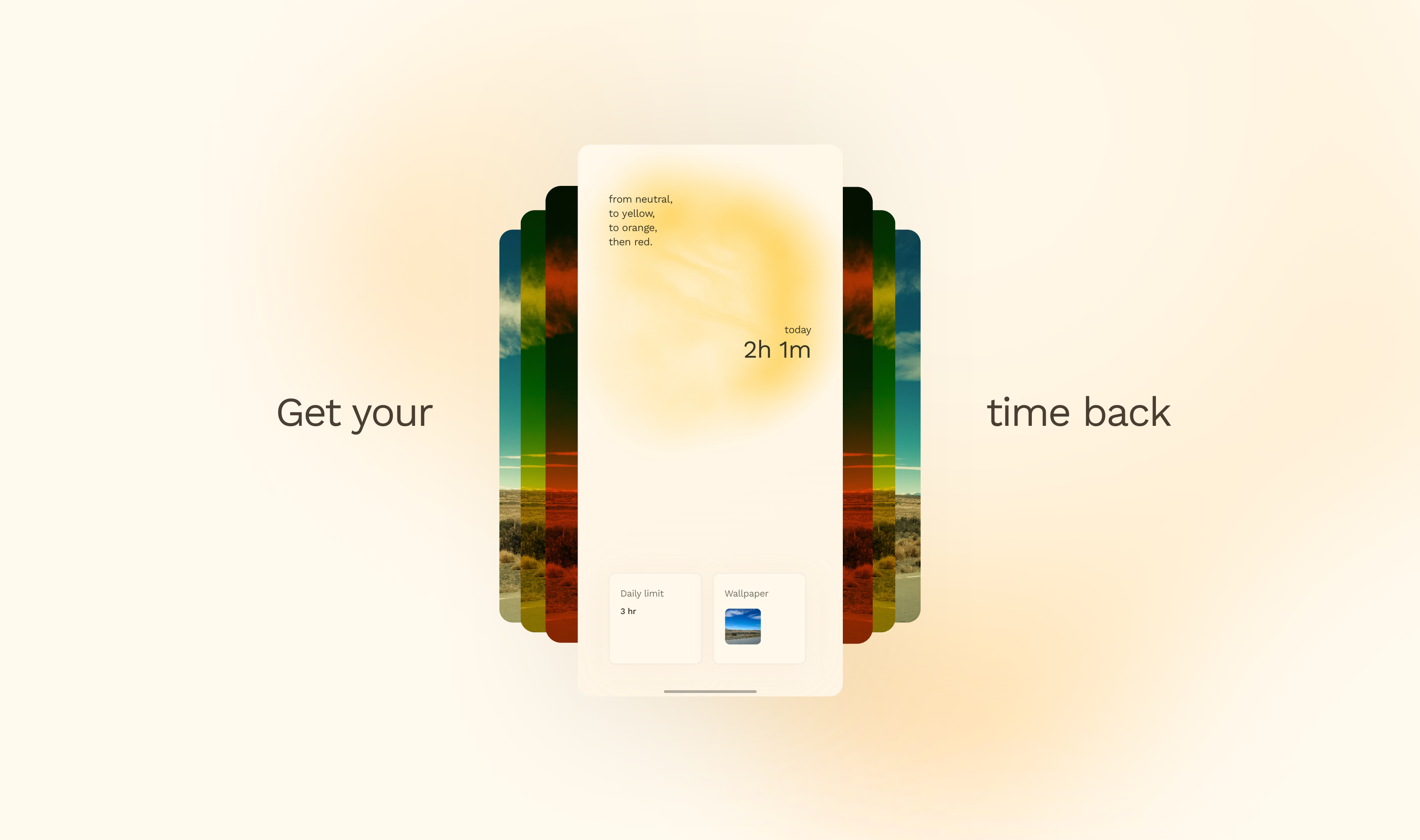
Every decision followed three rules: quiet, simple, no friction. Anything that didn't meet them was removed. Visually, the app had to feel warm, calm, and easy to use.
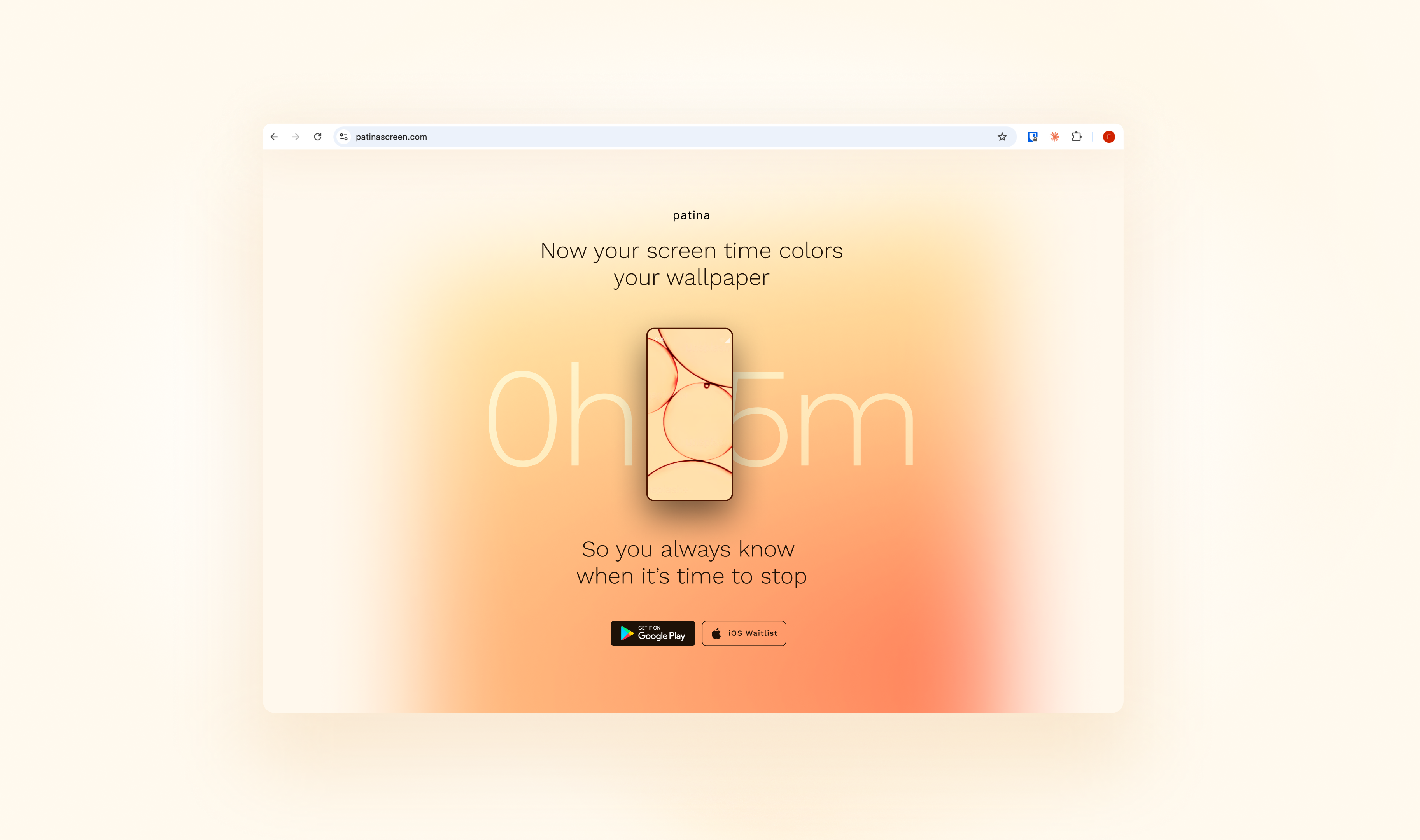
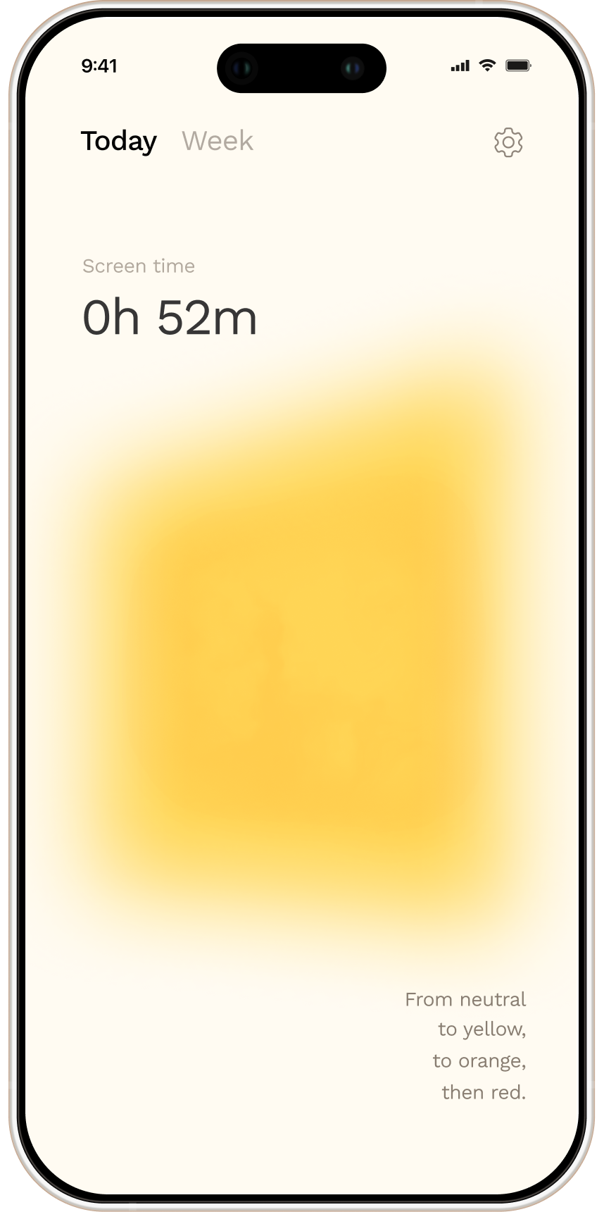
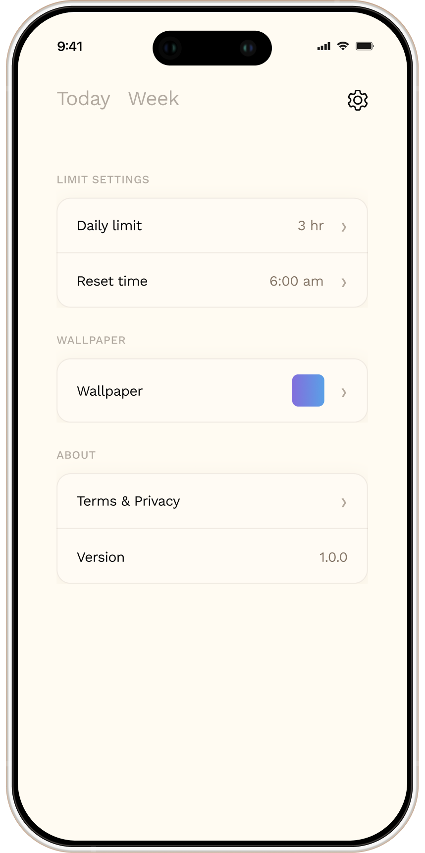
The homepage reflects that: your daily screen time limit and active wallpaper are visible upfront, with no need to open a settings page.
There is also a subtle living element that shifts color over time, mirroring the wallpaper. It's just color and shape moving slowly, intended to create a calming effect and gently slow you down.
The website intro has a completely different visual style from Patina's color palette and vibe. Why?
I wanted to tell a story of a problem that meets a solution. So I thought about what visual environment could express the feeling of being trapped, of repetition with no control.
Black and white felt right for that, it reinforces the heaviness of it. Then color arrives as the solution. You snap out of the repetition and back into the real colorful world. That contrast is intentional.
What almost made you give up?
The tint wasn't resetting overnight automatically. You had to open the app, which destroyed the core concept. The whole point was that it works silently in the background without you doing anything.
I kept pushing with AI until we found the answer together. But that solution added some friction. So I had to make a decision: accept some friction at onboarding so the core concept could live.
While testing with users I realized that tradeoff might cost me more than I thought. I iterated and I'm still measuring the results.
What was the biggest design mistake so far?
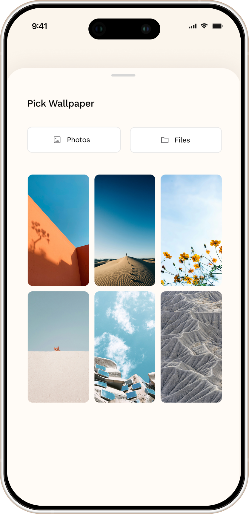
Ignoring a pain point I knew would hurt acquisition. What I really wanted was to tint the user's existing wallpaper without them having to choose a new one. Android doesn't allow that.
So users had to find an image in their gallery just to complete onboarding. That's real friction at the worst possible moment. I knew it was a problem and launched anyway. I've since added in-app wallpaper options so users can pick one and move on.
What's next for Patina?
Two things are coming before real distribution:
First, the homepage is getting today and weekly screen time stats, which means reorganising the layout and moving settings out. Tabs system make it easier jumping between today, week and settings. Simple nav.
Second, I am testing a lock screen shake feature that shows your exact screen time without unlocking, offering more precise awareness and a partial solution for color blindness. Because shaking feels a bit contradictory to Patina's quiet nature, it might become a setting to keep the number always visible instead. Either way, it was fun to build.
Patina is still early. I haven't started active distribution because I want clean measurement in place first. The core question is whether the wallpaper actually shifts screen time, not just whether people notice the colour.
What did you learn?
Owning every product decision alone, what to build, what to cut, what to ship, teaches you to see a product in 360°.
You know a lot of things in theory until you are the only one responsible for them. Things that once looked like bad management start making sense.
MORE PROJECTS