Beyond just browsing for construction gear, what does this platform actually solve for the user?
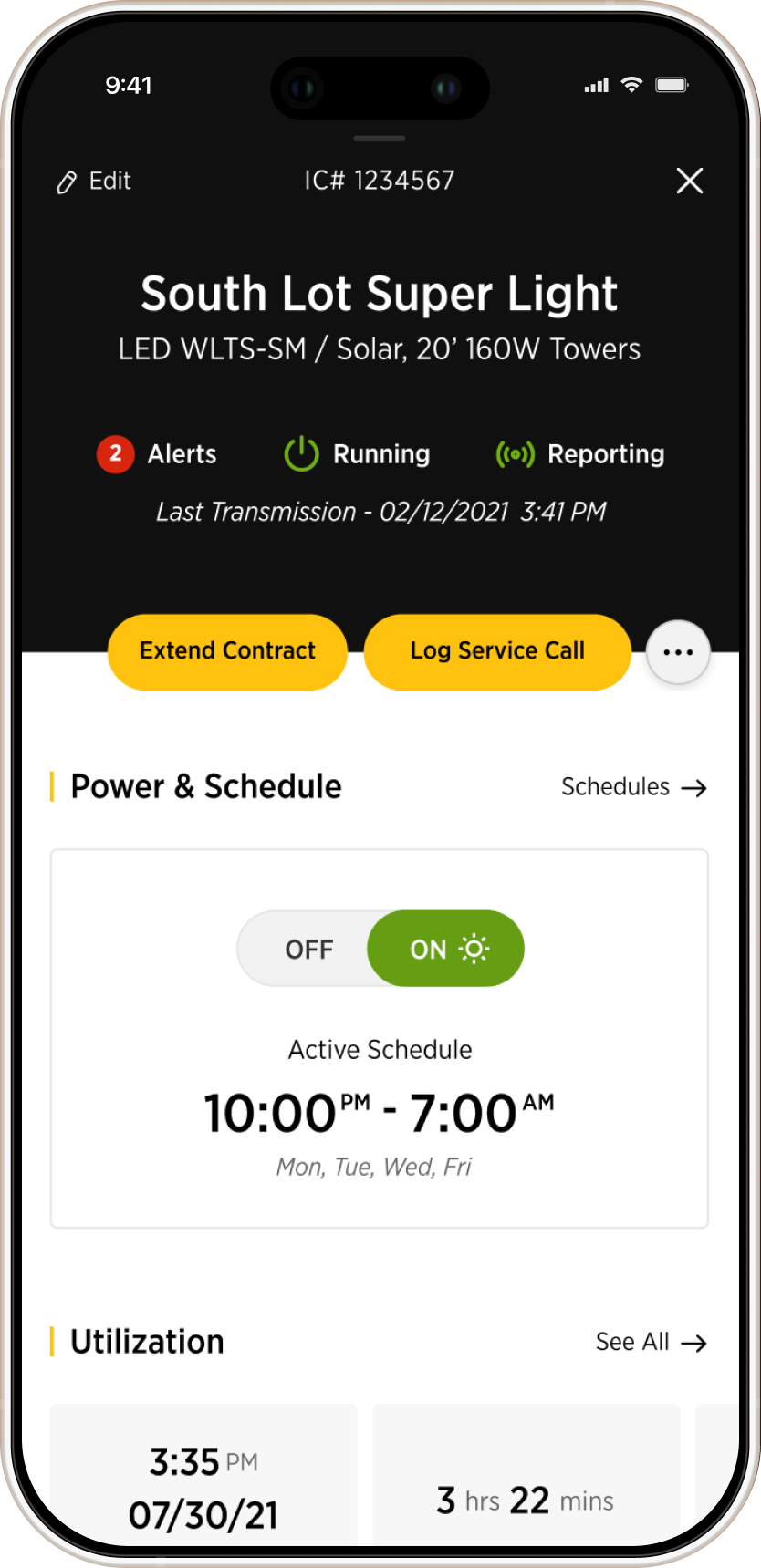
It acts as a command center for managing every piece of equipment and job sites, giving you total control from anywhere. You have real-time analytics, equipment utilization data, diagnostics, alerts.
It's a predictive management platform. It takes the chaos of a billion-dollar construction site and shrinks it down into an intuitive interface where you can rent, track, secure, and pay for everything easily.
What was your role in the team?
I was responsible for co-creating the visual direction, building the design system from scratch, designing and prototyping entire flows for complex features. I also handled presentations to very demanding stakeholders.
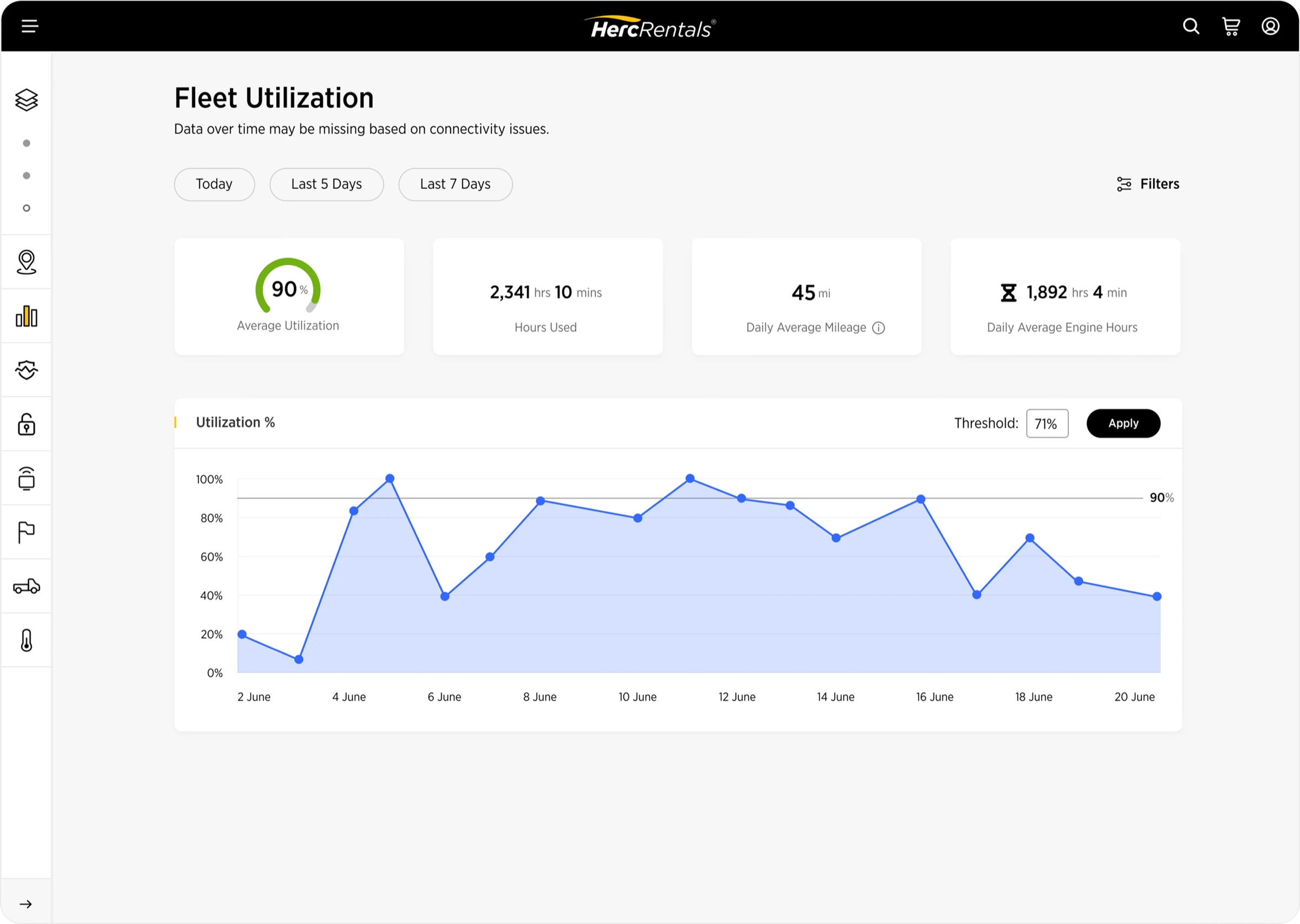
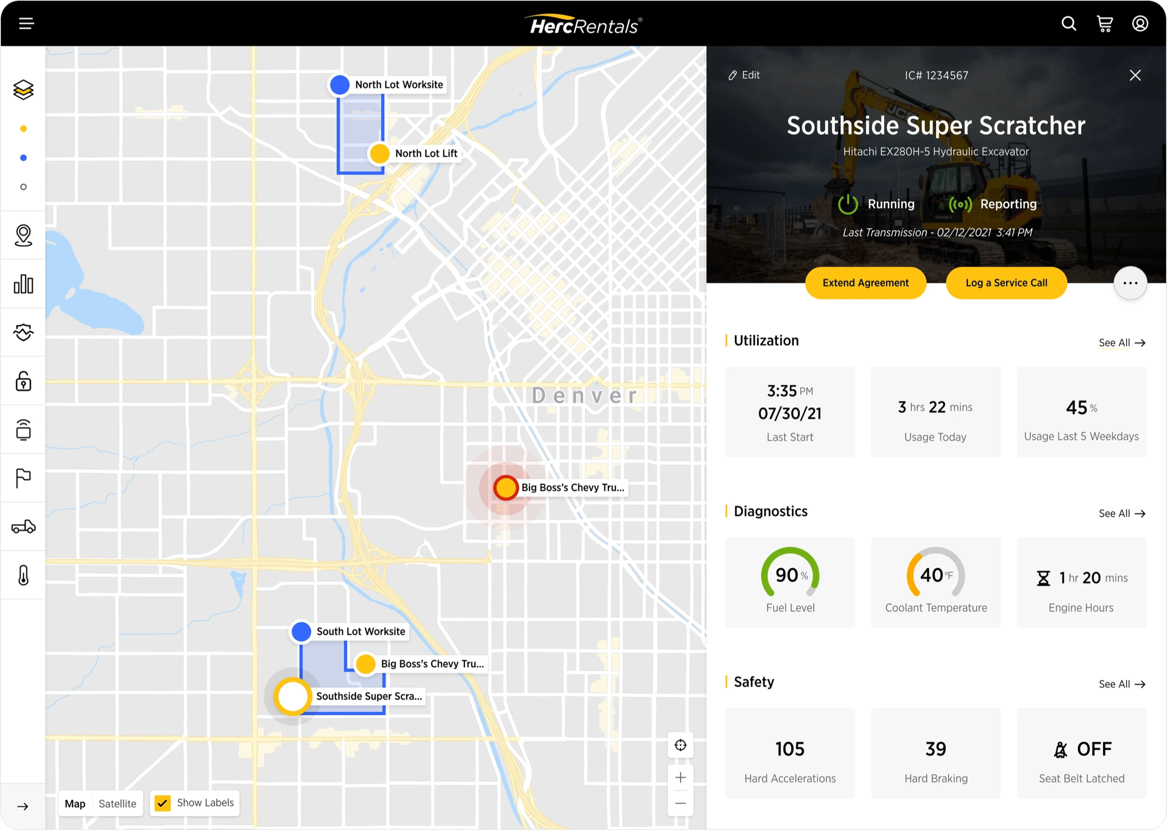
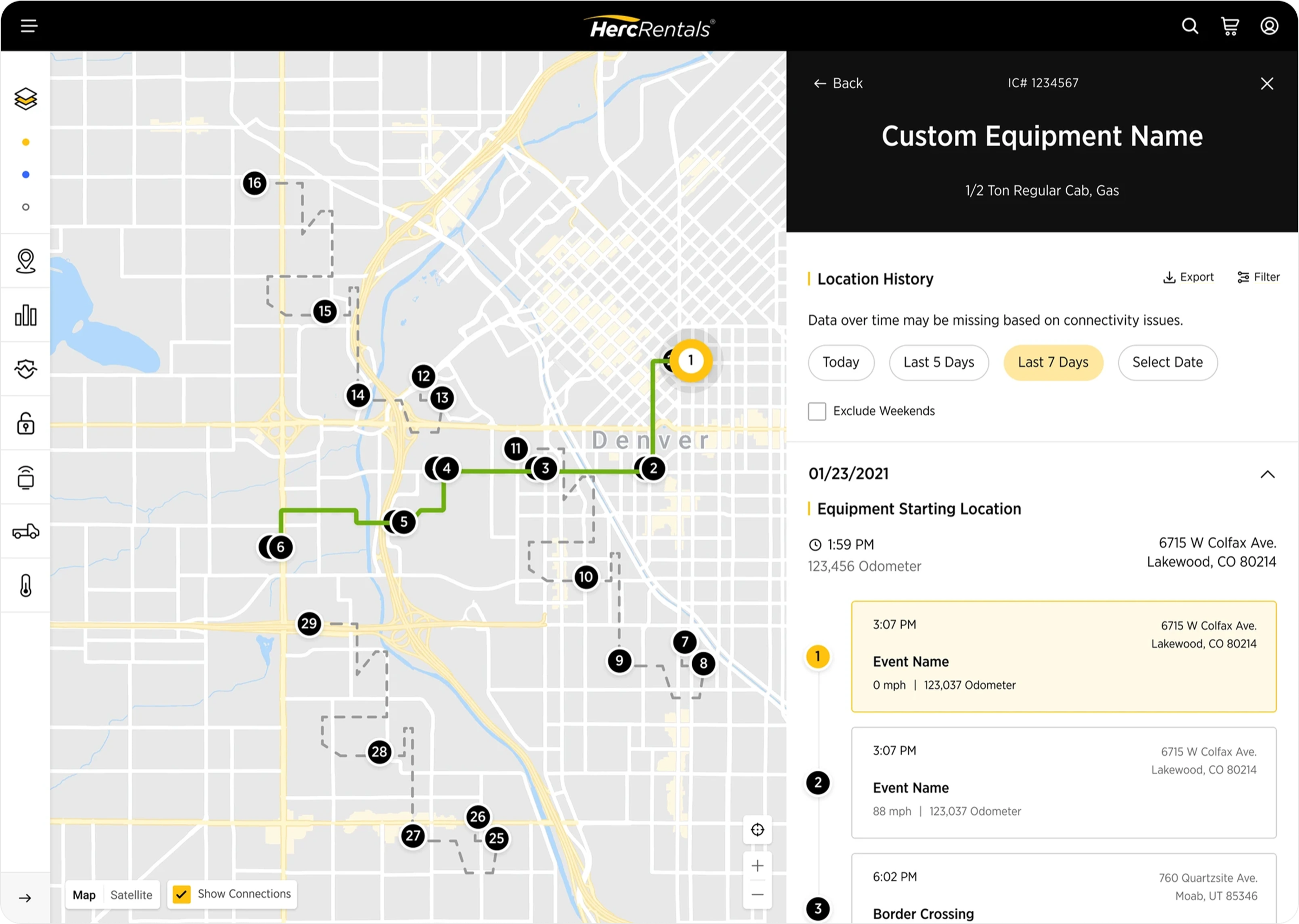
I was responsible for the fleet management and tracking side of the platform (telematics), which was one of the most demanding and complex part of the product to design for.
Construction is not a beautiful world. How did you approach the UI?
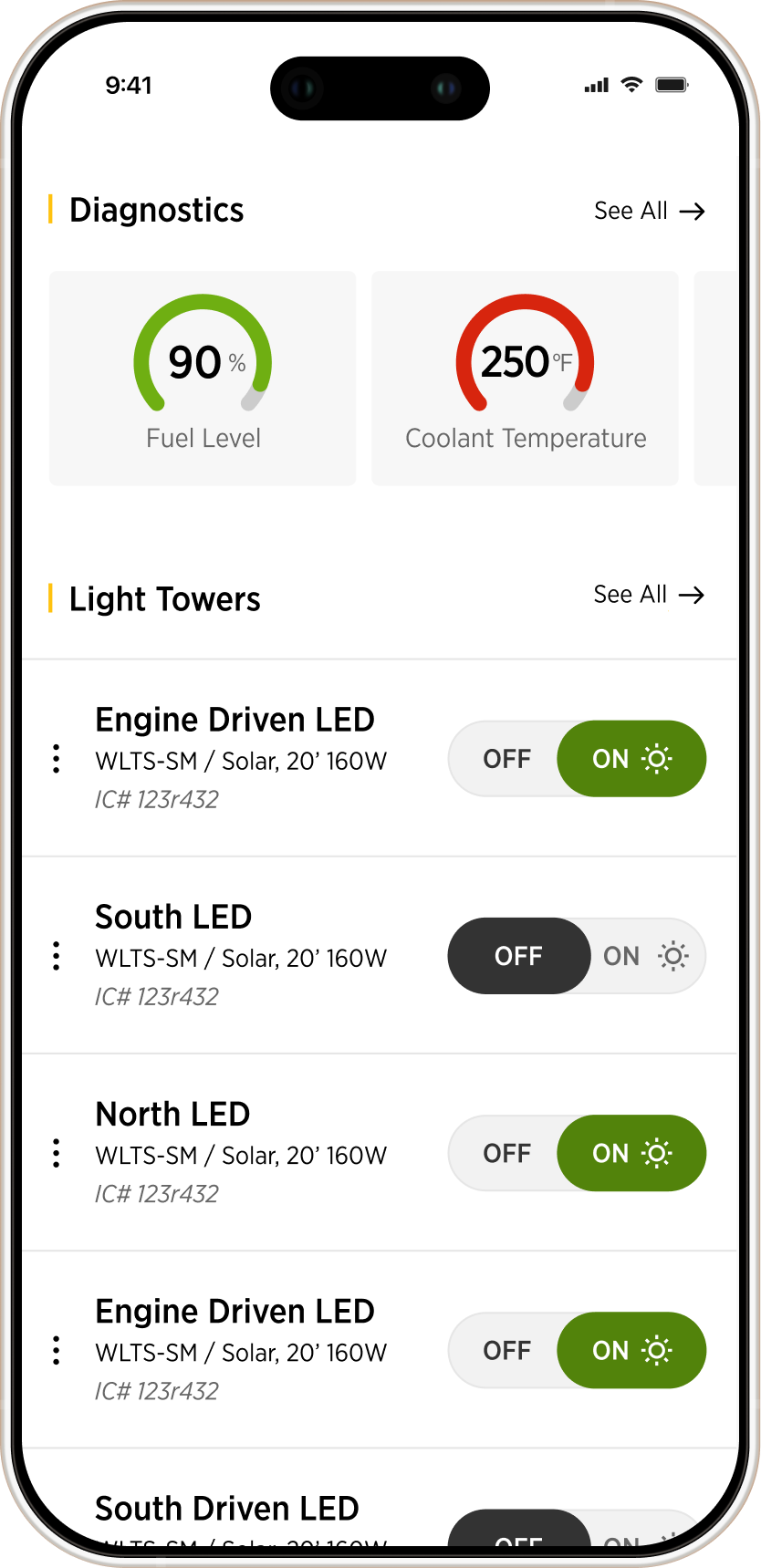
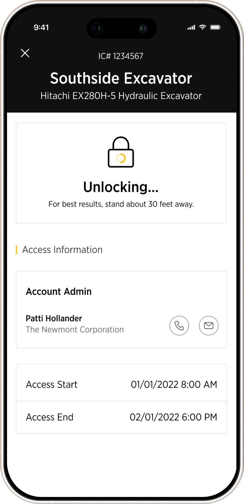
We spent a lot of time finding the right balance between functionality and sleekness because the standards were high. But we also had to design for the reality of a job site. This platform was being used on tablets and phones in direct sunlight by stressed project managers.
In an interface full of data visualization, decoration wasn't an option. We stripped it back as much as possible while still feeling intentional and premium, obsessing over typography scale, color balance, and attention to detail to ensure everything was readable in those harsh conditions.
What was the hardest design challenge?
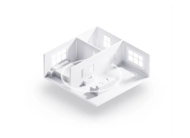
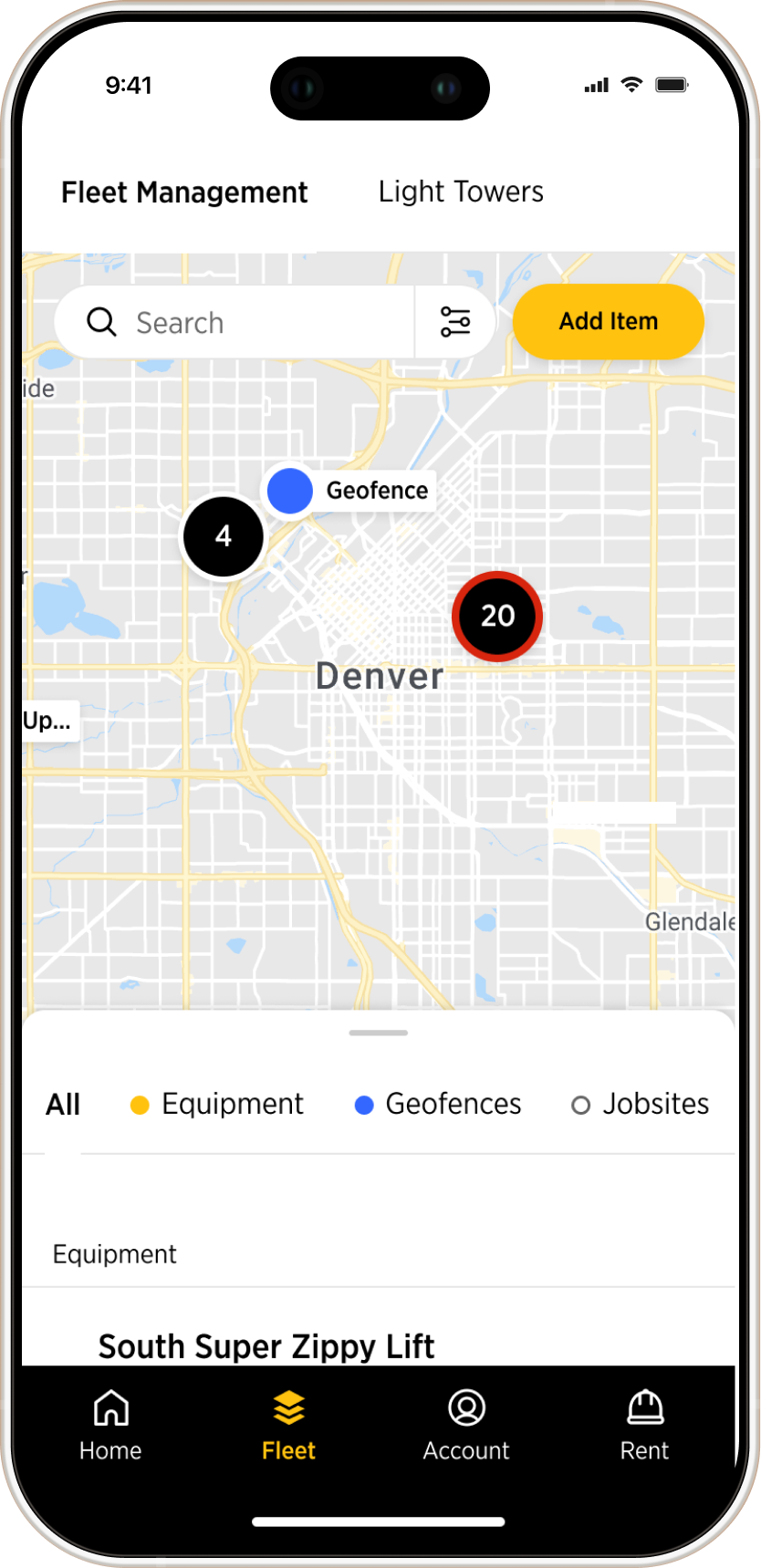
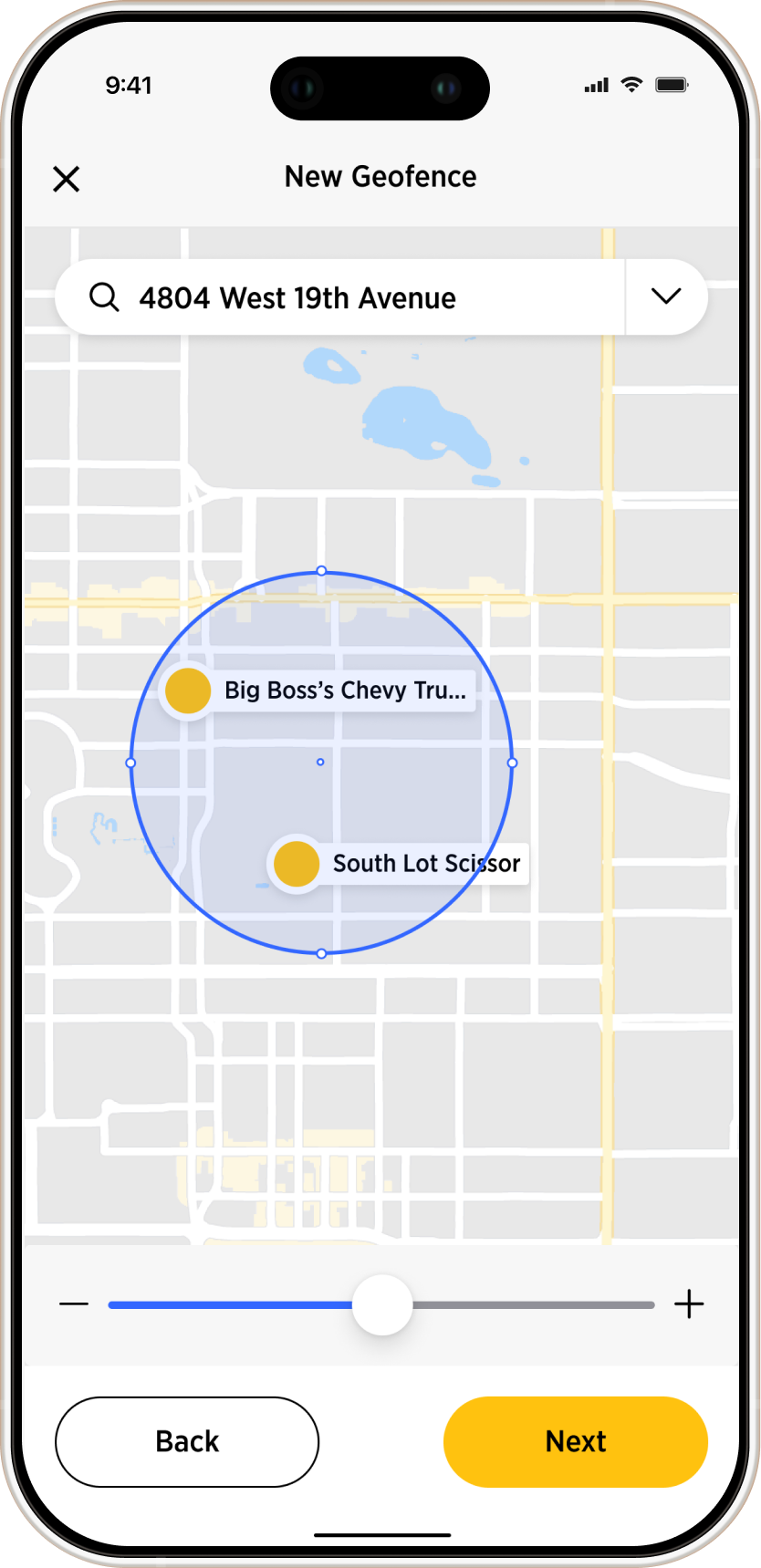
It was the fleet management system, a live map where users track dozens of pieces of equipment on one screen. You've got trucks, lifts, and excavators, some moving, some idling, and some broken. On top of that we had geofences and job sites. It was a visual mess.
I was responsible for building that visual language from scratch. I started with shapes for categories and specific colors for equipment status. I also built the clustering logic to handle the cognitive load of multiple elements in the map, creating all the rules and logic so the devs could build something that actually worked. It took a lot of testing, but we turned a chaotic map into a precision tool.
150% adoption growth in 12 months. Do you take credit for that?
I believe our design played a fundamental part. When clients saw the demos, they could instantly see that the platform was easy to use and extremely useful.
We didn't just build a platform, we built a tool that sales teams were proud to demo and customers actually wanted to use every day.
Looking back, what would you do differently?
The project had an amazing team and everything was carefully considered. I learned a lot from the people around me.
But if I had to pick one thing, I would be more conservative with typography. Fewer sizes and weights, and more use of position and colour to carry hierarchy.
What did you learn?
MORE PROJECTS